Designing for Shopee vs Lazada: Key Differences
Understanding the unique design requirements, buyer behaviors, and optimization tactics that separate Southeast Asia’s two biggest e-commerce platforms
Why Platform Differences Matter for Your Store
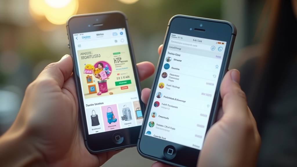
If you’re selling on Malaysian marketplaces, you’ve probably noticed something: what works brilliantly on Shopee doesn’t always translate to Lazada. It’s not just about different logos. These platforms have fundamentally different buyer expectations, design conventions, and conversion patterns.
The good news? Once you understand the key differences, you can tailor your product pages, store layouts, and checkout flows to match each platform’s strengths. We’ve broken down exactly what separates these two giants and how to optimize for each one.

The Core Design Philosophy Differences
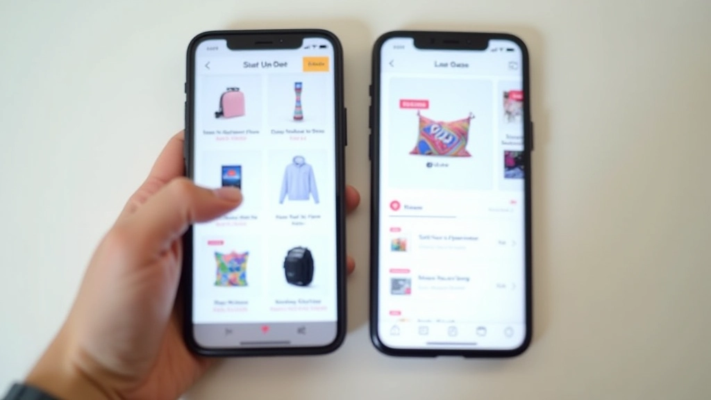
Shopee’s design leans toward gamification and engagement. You’ll see flash sales, interactive badges, animated elements, and urgency signals everywhere. The platform rewards sellers who create energy and movement on their product pages. Bright colors, emoji, countdown timers — these aren’t just allowed, they’re expected.
Lazada takes a more structured, traditional retail approach. Think department store rather than bustling night market. The design is cleaner, more minimal, and focuses on information hierarchy and trust signals. Product specs matter more than personality. Customer reviews, ratings, and detailed product descriptions dominate the layout.
The practical takeaway: Shopee rewards visual excitement and scarcity tactics. Lazada rewards clarity and credibility. Your design choices should reflect these different buyer mindsets.
Product Page Layout Strategy
On Shopee, your product main image matters, but your secondary images and lifestyle photos drive real impact. Shopee buyers scroll through photos — lots of them. Include at least 8-12 images showing the product from every angle, in use, in different colors, and with size comparison. Add text overlays with key benefits directly on images. “Waterproof for 3 months” or “Fits sizes 8-16” printed right there.
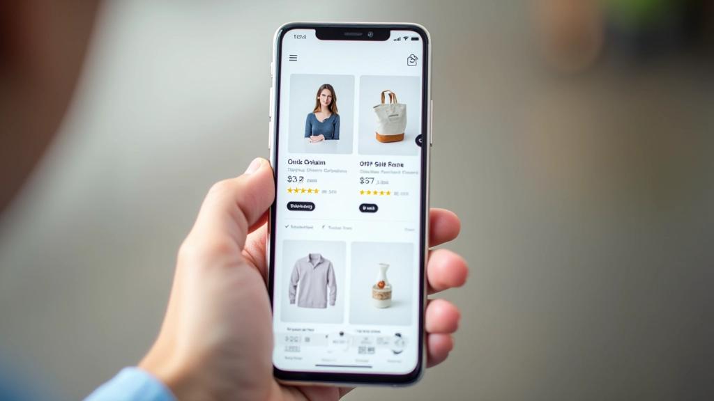
Lazada buyers want to know specs first. Your first section should be product name, price, and rating. Then comes a detailed specifications table — dimensions, materials, warranty, shipping info. Images should be clean and professional, not lifestyle shots. One main product image on a white background works better here than a lifestyle photo.
On Shopee, emphasize flash sale pricing and limited stock badges. On Lazada, emphasize seller credibility badges, return policies, and customer review counts.
Understanding Your Buyer’s Mindset
Shopee’s typical buyer is looking for deals. They’re hunting, comparing prices across shops, collecting vouchers, and watching seller flash sales. They respond to urgency. If you say “Only 3 left at this price” or “Flash sale ends in 2 hours,” they’ll act faster. This buyer appreciates engagement — questions and answers, seller responses, community vibes.
Lazada’s buyer wants reliability and confidence. They’re comparing quality and authenticity more than hunting for the lowest price. They read reviews carefully, check return policies, and want to know exactly what they’re getting. This buyer values transparency and detailed information.
Design Implication
Your Shopee store layout should emphasize flash sales, seller badges, and engagement metrics. Your Lazada store should emphasize detailed specs, reviews, and trust indicators.

Checkout Flow & Payment Integration
Shopee’s checkout is quick and playful. Buyers expect multiple payment options, one-click ordering if they’re logged in, and instant confirmation. The platform handles payment processing, so your role is making the product page so compelling they reach checkout. Shopee Pay integration is standard, and most Malaysian buyers use it alongside credit cards and bank transfers.
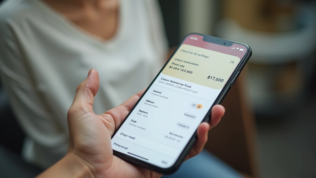
Lazada’s checkout emphasizes security and choice. Buyers see more information — shipping options, warranty selections, seller information. The flow is slightly longer but feels more trustworthy. Payment partners like Lazada Wallet, credit cards, and installment options (important in Malaysia) are clearly displayed. Buyers want to see exactly what they’re paying for before confirming.
For Malaysian sellers specifically: Lazada’s installment payment options (0% financing up to 12 months) convert better for products over RM300. Shopee shoppers are more impulse-driven and respond better to cart abandonment incentives.
Specific Optimization Tactics by Platform
Shopee Optimization
- Use bright, contrasting colors on product images
- Add benefit callouts directly on product photos
- Include countdown timers for limited-time offers
- Respond to Q&A within 4 hours for engagement score
- Create bundle deals and flash sale variations
- Use emojis and casual language in descriptions
Lazada Optimization
- Maintain clean, professional product images
- Create detailed product specification tables
- Highlight return policies and warranty clearly
- Feature customer review count prominently
- Offer installment payment options for higher-value items
- Use formal, clear language in product descriptions
Putting It All Together
The best sellers on both platforms don’t just copy-paste their content. They recognize that Shopee buyers and Lazada buyers are fundamentally different shoppers with different expectations. Shopee is about energy, deals, and excitement. Lazada is about trust, clarity, and quality.
Start by analyzing your top competitors on each platform. Look at their product photos, description lengths, what badges they use, how they structure pricing information. You’ll quickly see the pattern. Then adapt your store design, product pages, and even your language to match each platform’s culture.
Don’t worry about perfection. Test your changes over 2-3 weeks, measure conversion rates, and adjust. One platform might outperform the other for your specific products — that’s valuable data. Use it to decide where to invest more energy.
Want to dive deeper into e-commerce design? Explore our related guides below to optimize your complete store experience.
Educational Disclaimer
This article provides general guidance on e-commerce platform design and optimization strategies. Platform features, policies, and best practices change frequently, so we recommend visiting official Shopee and Lazada seller documentation for the most current information. Individual results vary based on product category, pricing, competition, and market conditions. This content is for informational purposes and doesn’t constitute professional business or design consultation. Consider consulting with experienced e-commerce specialists for personalized advice for your specific business situation.